機能紹介 · 機能紹介セクション
アイソメトリック投影の機能紹介セクション
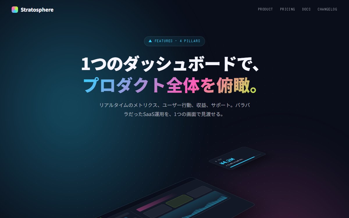
30度傾斜の擬似3DでUIカードを浮かべる、未来感のあるアイソメトリック機能紹介。Stripe・Linear・Vercel系のモダンSaaSの定番表現を CSS だけで再現する尖った設計。
このブラウザー内に保存します。別の端末との同期はなく、サイトデータを消すと保存も消えます。
印刷時は見本を静止画にし、プロンプトと解説を出力します。PDF保存はブラウザーの印刷画面から選べます。
Vibehaus · デザイン資料
https://vibe.itlibra.com/design/isometric-feature/
完全無料・著作権フリー(CC0)· 料金¥0 · 商用利用・改変自由
プレビュー
指定幅で実際に組み替えて表示します。表示領域より広い場合は、この枠の中で横へスクロールできます。
AIへの指示文
モダンSaaSの機能紹介セクションを、アイソメトリック投影で擬似3D化して作ってください。

要件:
- 配色: 暗背景 #0a0e1a + アクセント シアン #2dd4ff / マゼンタ #ff5cb6 / ライム #b4ff39。
- 中央に大型のメイン画面(プロダクト UI のモック)を CSS transform: rotateX(20deg) rotateY(-25deg) で傾斜。
- メイン画面の周囲にサテライト UI 要素(カード・ピル・グラフ)を浮遊させる。それぞれ異なる傾斜角・z-index で重ね順を作る。
- 各サテライトは半透明・blur 背景(backdrop-filter)でガラス感を持たせる。
- 影は CSS box-shadow で柔らかく長距離。3D感を補強。
- 上部に短い見出し + サブテキスト。下部に4つの機能リスト(icon + 短文)。
- 浮遊アニメ(CSS keyframes、各サテライトが異なる位相で上下にゆっくり)。
- フォント: 見出し Inter Bold、本文 Inter + Noto Sans JP、メタ JetBrains Mono。
- JS不要。prefers-reduced-motion でアニメ停止。
- フルレスポンシブ。スマホでは 3D を解除して通常配置に崩す。
バリエーション
ライトテーマ版
背景を白 #fafafb に、アクセント色は彩度を下げる。Stripe のドキュメントサイト風に。
1メイン+ベルト版
サテライトを廃し、メイン画面の左右に等間隔の小さい UI 要素ベルトを配置。
Apple 風のプロダクトショーケースに変化。
このプレビューのコード
HTMLとCSSの1ファイルです。外部依存・広告・解析コードはありません。CSSで立体的な画面と浮遊を描く架空の製品です。動きの低減設定では静止します。ナビはページ内の説明へ移動し、数値の更新・外部連携・API・契約は実装していません。
コードを表示
<!doctype html>
<!-- Vibehaus — CC0。外部素材・ライブラリ不要の1ファイル版。製品・性能値・認証は架空の表示見本です。 -->
<html lang="ja">
  <head>
    <meta charset="utf-8" />
    <meta name="viewport" content="width=device-width, initial-scale=1" />
    <meta name="robots" content="noindex" />
    <title>アイソメトリック投影の機能紹介セクション — Vibehaus プレビュー</title>
    <style>
      :root {
        --bg: #0a0e1a;
        --bg-2: #131826;
        --surface: rgba(245, 245, 255, 0.06);
        --border: rgba(245, 245, 255, 0.12);
        --fg: #f5f5ff;
        --muted: rgba(245, 245, 255, 0.65);
        --quiet: rgba(245, 245, 255, 0.4);
        --cyan: #2dd4ff;
        --magenta: #ff5cb6;
        --lime: #b4ff39;
        --yellow: #ffd86b;
      }
      * { box-sizing: border-box; }
      html, body { margin: 0; padding: 0; }
      body {
        font-family: "Inter", "Noto Sans JP", "Hiragino Kaku Gothic ProN",
          sans-serif;
        background: var(--bg);
        color: var(--fg);
        line-height: 1.7;
        -webkit-font-smoothing: antialiased;
        position: relative;
        overflow-x: hidden;
        min-height: 100dvh;
      }

      /* Mesh / glow background */
      body::before {
        content: "";
        position: absolute;
        inset: -10vh -10vw;
        background:
          radial-gradient(45% 50% at 25% 30%, rgba(45, 212, 255, 0.32), transparent 70%),
          radial-gradient(40% 50% at 75% 70%, rgba(255, 92, 182, 0.28), transparent 70%),
          radial-gradient(35% 45% at 50% 100%, rgba(180, 255, 57, 0.18), transparent 70%);
        filter: blur(60px);
        z-index: 0;
      }
      /* Dot grid floor */
      body::after {
        content: "";
        position: absolute;
        inset: 0;
        background-image: radial-gradient(rgba(245, 245, 255, 0.06) 1px, transparent 1px);
        background-size: 28px 28px;
        z-index: 0;
        mask-image: radial-gradient(ellipse 70% 60% at center, #000 30%, transparent 80%);
      }

      header.bar {
        position: relative;
        z-index: 5;
        display: flex;
        align-items: center;
        justify-content: space-between;
        padding: 1.1rem clamp(1rem, 4vw, 2.5rem);
      }
      .logo {
        display: inline-flex;
        align-items: center;
        gap: 0.55rem;
        font-weight: 800;
        font-size: 1.1rem;
        letter-spacing: -0.01em;
      }
      .logo::before {
        content: "";
        width: 22px; height: 22px;
        border-radius: 6px;
        background: conic-gradient(from 180deg, var(--cyan), var(--magenta), var(--lime), var(--cyan));
      }
      header.bar nav {
        display: inline-flex;
        gap: 1.5rem;
        font-family: "JetBrains Mono", monospace;
        font-size: 0.74rem;
        letter-spacing: 0.12em;
        text-transform: uppercase;
        color: var(--muted);
      }
      header.bar nav a { color: inherit; text-decoration: none; }
      header.bar nav a:hover { color: var(--cyan); }
      @media (max-width: 720px) { header.bar nav { display: none; } }

      .head {
        position: relative;
        z-index: 5;
        text-align: center;
        padding: clamp(2rem, 5vw, 4rem) clamp(1rem, 4vw, 2.5rem) 0;
        max-width: 900px;
        margin: 0 auto;
      }
      .head .eyebrow {
        display: inline-flex;
        align-items: center;
        gap: 0.55rem;
        padding: 0.4rem 0.9rem;
        border: 1px solid var(--border);
        border-radius: 999px;
        font-family: "JetBrains Mono", monospace;
        font-size: 0.72rem;
        letter-spacing: 0.16em;
        text-transform: uppercase;
        color: var(--cyan);
        margin-bottom: 1.5rem;
        background: rgba(45, 212, 255, 0.08);
      }
      .head h2 {
        margin: 0 0 1rem;
        font-size: clamp(2.2rem, 5vw, 3.6rem);
        line-height: 1.35;
        letter-spacing: 0;
        font-weight: 800;
      }
      .head h2 :lang(ja) { letter-spacing: 0; line-height: 1.4; }
      .head h2 .grad {
        background: linear-gradient(135deg, var(--cyan), var(--magenta) 60%, var(--lime));
        -webkit-background-clip: text;
        background-clip: text;
        color: transparent;
      }
      .head p.lede {
        margin: 0 auto;
        font-size: 1.05rem;
        line-height: 1.85;
        color: var(--muted);
        max-width: 56ch;
      }

      /* Iso scene */
      .iso-scene {
        position: relative;
        z-index: 5;
        margin: clamp(2rem, 4vw, 3rem) auto 0;
        height: clamp(420px, 56vw, 640px);
        max-width: 1100px;
        perspective: 1400px;
      }
      .iso-scene > * {
        position: absolute;
        transform-style: preserve-3d;
      }

      /* Floating animation */
      @keyframes floaty {
        0%, 100% { transform: var(--base-transform) translateY(0); }
        50% { transform: var(--base-transform) translateY(-18px); }
      }

      /* Main panel — large product window */
      .iso-main {
        --base-transform: rotateX(58deg) rotateZ(-44deg);
        top: 18%; left: 50%;
        margin-left: -250px;
        width: 500px;
        height: 320px;
        background: var(--bg-2);
        border: 1px solid var(--border);
        border-radius: 14px;
        transform: var(--base-transform);
        box-shadow:
          0 60px 120px -20px rgba(0, 0, 0, 0.6),
          0 0 0 1px rgba(45, 212, 255, 0.12),
          inset 0 1px 0 rgba(255, 255, 255, 0.08);
        overflow: hidden;
        animation: floaty 8s ease-in-out infinite;
      }
      .iso-main .iso-toolbar {
        height: 28px;
        padding: 0 12px;
        background: var(--bg);
        border-bottom: 1px solid var(--border);
        display: flex;
        align-items: center;
        gap: 6px;
      }
      .iso-main .iso-toolbar i {
        width: 8px; height: 8px;
        border-radius: 999px;
        display: block;
      }
      .iso-main .iso-toolbar i:nth-child(1) { background: #ff5f56; }
      .iso-main .iso-toolbar i:nth-child(2) { background: #ffbd2e; }
      .iso-main .iso-toolbar i:nth-child(3) { background: #27c93f; }
      .iso-main .iso-content {
        padding: 16px 18px;
        display: grid;
        grid-template-columns: 130px 1fr;
        gap: 14px;
        height: calc(100% - 28px);
      }
      .iso-main .iso-side {
        display: flex;
        flex-direction: column;
        gap: 8px;
        padding-right: 12px;
        border-right: 1px solid var(--border);
      }
      .iso-main .iso-side div {
        height: 14px;
        background: var(--surface);
        border-radius: 4px;
      }
      .iso-main .iso-side div:nth-child(2) { width: 80%; background: rgba(45, 212, 255, 0.25); }
      .iso-main .iso-body { padding: 6px; }
      .iso-main .iso-body .h {
        height: 22px;
        background: linear-gradient(90deg, rgba(255, 92, 182, 0.4), transparent);
        border-radius: 4px;
        margin-bottom: 14px;
        width: 60%;
      }
      .iso-main .iso-body .row {
        display: grid;
        grid-template-columns: repeat(3, 1fr);
        gap: 10px;
        margin-bottom: 10px;
      }
      .iso-main .iso-body .row .tile {
        height: 50px;
        background: var(--surface);
        border: 1px solid var(--border);
        border-radius: 6px;
      }
      .iso-main .iso-body .row .tile:nth-child(2) { border-color: rgba(180, 255, 57, 0.35); background: rgba(180, 255, 57, 0.1); }
      .iso-main .iso-body .chart {
        height: 80px;
        background: linear-gradient(180deg, rgba(45, 212, 255, 0.18), transparent);
        border: 1px solid var(--border);
        border-radius: 6px;
        margin-top: 6px;
        position: relative;
      }
      .iso-main .iso-body .chart::after {
        content: "";
        position: absolute;
        bottom: 8px; left: 8px; right: 8px;
        height: 30px;
        background:
          linear-gradient(180deg, transparent, rgba(45, 212, 255, 0.4)),
          repeating-linear-gradient(90deg, transparent 0 12px, rgba(45, 212, 255, 0.25) 12px 14px);
        clip-path: polygon(0 100%, 8% 60%, 16% 80%, 24% 40%, 36% 70%, 48% 30%, 60% 60%, 72% 20%, 84% 50%, 100% 10%, 100% 100%);
      }

      /* Satellites */
      .iso-sat {
        background: var(--bg-2);
        border: 1px solid var(--border);
        border-radius: 12px;
        padding: 12px 14px;
        backdrop-filter: blur(16px);
        box-shadow: 0 30px 50px -10px rgba(0, 0, 0, 0.5);
        animation: floaty 7s ease-in-out infinite;
      }
      .iso-sat-1 {
        --base-transform: rotateX(58deg) rotateZ(-44deg);
        top: 6%; right: 20%;
        width: 200px;
        animation-delay: -2s;
      }
      .iso-sat-2 {
        --base-transform: rotateX(58deg) rotateZ(-44deg);
        top: 60%; left: 8%;
        width: 180px;
        animation-delay: -3.5s;
      }
      .iso-sat-3 {
        --base-transform: rotateX(58deg) rotateZ(-44deg);
        bottom: 8%; right: 12%;
        width: 200px;
        animation-delay: -1s;
      }
      .iso-sat .lab {
        font-family: "JetBrains Mono", monospace;
        font-size: 9px;
        letter-spacing: 0.14em;
        text-transform: uppercase;
        color: var(--quiet);
        margin-bottom: 6px;
      }
      .iso-sat .num {
        font-size: 22px;
        font-weight: 800;
        line-height: 1;
        margin-bottom: 4px;
      }
      .iso-sat-1 .num { color: var(--cyan); }
      .iso-sat-2 .num { color: var(--magenta); }
      .iso-sat-3 .num { color: var(--lime); }
      .iso-sat .delta { font-size: 10px; color: var(--muted); }
      .iso-sat .bar {
        margin-top: 8px;
        height: 4px;
        background: var(--surface);
        border-radius: 2px;
        overflow: hidden;
      }
      .iso-sat .bar > div {
        height: 100%;
        background: var(--cyan);
        border-radius: 2px;
      }
      .iso-sat-1 .bar > div { width: 78%; background: var(--cyan); }
      .iso-sat-2 .bar > div { width: 46%; background: var(--magenta); }
      .iso-sat-3 .bar > div { width: 92%; background: var(--lime); }

      /* Mobile fallback — flatten the 3D scene */
      @media (max-width: 760px) {
        .iso-scene { height: auto; padding: 1rem 0; perspective: none; }
        .iso-scene > * { position: relative; transform: none !important; margin: 0 auto 1rem; left: auto; right: auto; top: auto; bottom: auto; animation: none; }
        .iso-main { width: 100%; max-width: 420px; height: auto; aspect-ratio: 5 / 3.2; margin-left: auto; }
        .iso-sat { width: calc(100% - 2rem); max-width: 320px; }
      }
      @media (prefers-reduced-motion: reduce) {
        .iso-main, .iso-sat { animation: none; }
      }

      /* Feature list below scene */
      .features {
        position: relative;
        z-index: 5;
        max-width: 1100px;
        margin: 0 auto;
        padding: clamp(1rem, 3vw, 2.5rem) clamp(1rem, 4vw, 2.5rem) 3rem;
        display: grid;
        grid-template-columns: 1fr;
        gap: 1.25rem;
      }
      @media (min-width: 760px) { .features { grid-template-columns: repeat(4, 1fr); } }

      .feat {
        padding: 1.2rem 1.3rem;
        background: var(--surface);
        border: 1px solid var(--border);
        border-radius: 12px;
        backdrop-filter: blur(20px);
      }
      .feat .icon {
        width: 28px; height: 28px;
        border-radius: 6px;
        background: var(--surface);
        display: grid;
        place-items: center;
        margin-bottom: 0.85rem;
        color: var(--cyan);
      }
      .feat:nth-child(2) .icon { color: var(--magenta); }
      .feat:nth-child(3) .icon { color: var(--lime); }
      .feat:nth-child(4) .icon { color: var(--yellow); }
      .feat .icon svg { width: 16px; height: 16px; }
      .feat h3 {
        margin: 0 0 0.35rem;
        font-size: 0.98rem;
        font-weight: 700;
        line-height: 1.4;
      }
      .feat p {
        margin: 0;
        font-size: 0.85rem;
        line-height: 1.7;
        color: var(--muted);
      }

      /* 配布前の実幅監査: 内容を切らず、デモの行き先を示す */
      body::before { inset: 0; }
      body::before, body::after { pointer-events: none; }
      .iso-sat { transform: var(--base-transform); }
      header.bar nav a { display: inline-flex; align-items: center; min-height: 44px; }
      a:focus-visible { outline: 2px solid var(--cyan); outline-offset: 3px; }
      .feat { min-width: 0; overflow-wrap: anywhere; }
      .feat .icon { pointer-events: none; }
      .demo-note { position: relative; z-index: 5; max-width: 1020px; margin: 0 auto 2rem; padding: 0 1rem; color: var(--muted); }
      .demo-note h3 { color: var(--fg); line-height: 1.4; }
      .demo-note p { scroll-margin-top: 2rem; }
      @media (max-width: 760px) {
        .iso-main .iso-content { grid-template-columns: minmax(0, 1fr) minmax(0, 2fr); gap: 10px; padding: 12px; }
        .iso-main { min-height: 250px; }
      }
      .demo-note { font-size: 0.85rem; line-height: 1.8; letter-spacing: 0; }
    </style>
  </head>
  <body>
    <header class="bar">
      <div class="logo">Stratosphere</div>
      <nav>
        <a href="#features">Product</a>
        <a href="#demo-pricing">Pricing</a>
        <a href="#demo-docs">Docs</a>
        <a href="#demo-changelog">Changelog</a>
      </nav>
    </header>

    <div class="head">
      <span class="eyebrow">▲ FEATURES · 4 PILLARS</span>
      <h2>1つのダッシュボードで、<br/><span class="grad">プロダクト全体を俯瞰。</span></h2>
      <p class="lede">リアルタイムのメトリクス、ユーザー行動、収益、サポート。バラバラだったSaaS運用を、1つの画面で見渡せる。</p>
    </div>

    <div class="iso-scene" aria-hidden="true">
      <div class="iso-main">
        <div class="iso-toolbar"><i></i><i></i><i></i></div>
        <div class="iso-content">
          <div class="iso-side">
            <div></div><div></div><div></div><div></div><div></div><div></div>
          </div>
          <div class="iso-body">
            <div class="h"></div>
            <div class="row">
              <div class="tile"></div>
              <div class="tile"></div>
              <div class="tile"></div>
            </div>
            <div class="chart"></div>
          </div>
        </div>
      </div>

      <div class="iso-sat iso-sat-1">
        <div class="lab">▲ MRR</div>
        <div class="num">¥4.2M</div>
        <div class="delta">+ 12.4% vs last mo.</div>
        <div class="bar"><div></div></div>
      </div>

      <div class="iso-sat iso-sat-2">
        <div class="lab">◆ ACTIVE USERS</div>
        <div class="num">8,420</div>
        <div class="delta">+ 432 this week</div>
        <div class="bar"><div></div></div>
      </div>

      <div class="iso-sat iso-sat-3">
        <div class="lab">● UPTIME</div>
        <div class="num">99.99%</div>
        <div class="delta">SLA met 30/30 days</div>
        <div class="bar"><div></div></div>
      </div>
    </div>

    <div class="features" id="features" tabindex="-1">
      <article class="feat">
        <div class="icon" aria-hidden="true"><svg viewBox="0 0 24 24" fill="none" stroke="currentColor" stroke-width="2" stroke-linecap="round" stroke-linejoin="round"><polyline points="3 17 9 11 13 15 21 7"/><polyline points="14 7 21 7 21 14"/></svg></div>
        <h3>Realtime Metrics</h3>
        <p>1秒単位でMRR・離脱率・サポート滞留を更新。</p>
      </article>
      <article class="feat">
        <div class="icon" aria-hidden="true"><svg viewBox="0 0 24 24" fill="none" stroke="currentColor" stroke-width="2" stroke-linecap="round" stroke-linejoin="round"><circle cx="12" cy="12" r="3"/><path d="M12 1v6M12 17v6M4.22 4.22l4.24 4.24M15.54 15.54l4.24 4.24M1 12h6M17 12h6M4.22 19.78l4.24-4.24M15.54 8.46l4.24-4.24"/></svg></div>
        <h3>Custom Alerts</h3>
        <p>SLA違反・KPI閾値を Slack と PagerDuty に直送。</p>
      </article>
      <article class="feat">
        <div class="icon" aria-hidden="true"><svg viewBox="0 0 24 24" fill="none" stroke="currentColor" stroke-width="2" stroke-linecap="round" stroke-linejoin="round"><path d="M12 2L2 7l10 5 10-5-10-5z"/><polyline points="2 17 12 22 22 17"/><polyline points="2 12 12 17 22 12"/></svg></div>
        <h3>Multi-region</h3>
        <p>Tokyo / Virginia / Singapore へ自動レプリケート。</p>
      </article>
      <article class="feat">
        <div class="icon" aria-hidden="true"><svg viewBox="0 0 24 24" fill="none" stroke="currentColor" stroke-width="2" stroke-linecap="round" stroke-linejoin="round"><polygon points="13 2 3 14 12 14 11 22 21 10 12 10 13 2"/></svg></div>
        <h3>Open API</h3>
        <p>REST/GraphQL/Webhook、データ書き出しすべて対応。</p>
      </article>
    </div>
  <aside class="demo-note" aria-label="表示見本について"><p>架空の製品の表示見本です。数値・稼働率・連携先は説明用の設定です。データ更新・外部送信・API機能は含みません。</p><p id="demo-pricing" tabindex="-1"><strong>料金</strong> — 架空の製品のため契約プランはありません。このHTMLの利用料は¥0です。</p>
<p id="demo-docs" tabindex="-1"><strong>実装について</strong> — 立体画面はCSSで描画しています。数値は固定値で、外部連携・API接続・データ保存は別途実装が必要です。</p>
<p id="demo-changelog" tabindex="-1"><strong>更新履歴について</strong> — 製品のリリース履歴を置くためのナビの例です。実サービスの変更履歴は含みません。</p></aside>
  </body>
</html>
2026年10月14日、Chromiumで320・390・768・1280pxの描画とキーボードのフォーカス表示を確認しました。他のブラウザは未確認です。利用先のブラウザと実データでも確認してください。
概要
アイソメトリック投影は、もともと機械製図やテクニカルイラストの技法です。遠近法と違い、奥行きによって物の大きさが変わらない——だから図面として「正確に測れる」。その後、初期のビデオゲームがこの投影を採用し、近年は Stripe や Linear をはじめとするモダンSaaSがプロダクト紹介の定番表現として定着させました。
遠近法を捨てると何が得か
通常の遠近法(パースペクティブ)は、奥にあるものを小さく歪めます。機能紹介でこれをやると、奥のUIカードが読めなくなる。アイソメトリック投影はすべての要素を同じ縮尺で30度傾けるため、奥行きを表現しながら可読性を犠牲にしません。複数の機能カードを立体的に積み重ねても、どのカードも等しくくっきり見える——「奥行き」と「情報密度」を両立できる、これがこの投影の核心的な利点です。
崩れる形遠近法で奥行きを出す
奥にあるものが小さく歪みます。機能紹介でこれをやると奥のUIカードが読めなくなり、立体感と引き換えに情報を落とすことになります。
効く形等角投影で奥行きを出す
すべての要素が同じ縮尺で傾くので、積み重ねてもどのカードも等しくくっきり見えます。奥行きと情報密度を両立できるのがこの投影の核心です。
「デジタル製品」であることの宣言
平らに並べた機能カードは文書のように見えます。アイソメトリックに浮かせたUIカードは、操作できるオブジェクトのように見えます。この差は小さくありません。訪問者は無意識に「これは触れるもの、動くものだ」と受け取り、プロダクトへの期待値が上がります。フラットなSaaSサイトが氾濫する中で、立体感は記憶のフックとしても機能します。
仕上げの判断軸
傾き角度(典型的には rotateX/rotateZ の組み合わせ)はページ全体で統一すること。カードごとに角度がぶれると、立体感ではなく「崩れ」に見えます。3Dライブラリは不要で、CSS transform だけで軽量に実装可能。要素が多いと視覚的に渋滞するため、1画面のアイソメ要素は5〜7個までに抑え、モバイルでは傾きを浅くするか平置きに切り替えます。
機能紹介の構成要素
使いどころ
- 開発者向けモダンSaaSのLP
- データ可視化・BIプロダクト
- 技術ブログのカバー画像
- ゲーム・メタバース系のプロダクトページ
- 未来感を打ち出したいスタートアップ
このデザインの分類
背景と狙いどころ
よくある質問
3D崩しに JS は要らない?
モバイルで3Dを維持すべき?
アクセシビリティの落とし穴は?
この画面を実装する
動くサンプルとコピペできるコードを、技術別にまとめています。
関連するデザイン

寒色グラデーションのAIツール機能紹介
紺の地に水色から藍色へのグラデーションを重ねた、AI議事録ツールの機能紹介セクション。見出しの一部だけを文字の幅で塗り、大きなカード1枚と小さなカード3枚で「何がどれだけ減るか」を数字と帯の長さで見せる。

タイル型グリッドの機能紹介
大小が異なるタイルを組み合わせて 6 機能を並べる、暗背景のベントーグリッド (タイル型レイアウト) の機能紹介セクション。主役の機能を大きく、補助機能を小さく配置することで、説明文を読まなくても重みづけが伝わる設計。

B2Bコーポレートの機能紹介セクション
B2B SaaSやエンタープライズ製品向けの機能紹介セクション。落ち着いた寒色配色と整然としたグリッド、データ感のあるアイコンで「実用と信頼」を伝える設計。