アプリ画面 · アプリUI
3画面を重ねるアプリUI
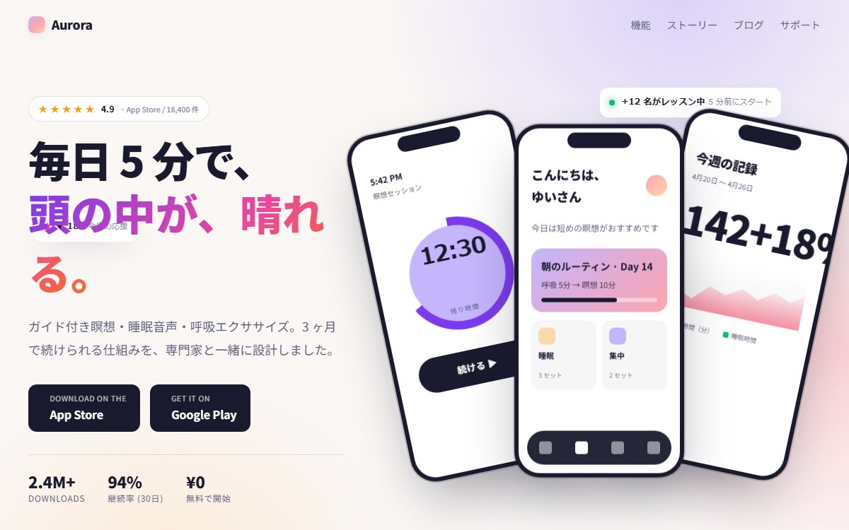
モバイルアプリのプロダクトサイト向けに、傾けた3枚のスマホフレームに UI スクリーンを並べるショーケース。フィットネス・健康・SaaS モバイルアプリの定番表現を CSS だけで構築する尖った設計。
このブラウザー内に保存します。別の端末との同期はなく、サイトデータを消すと保存も消えます。
印刷時は見本を静止画にし、プロンプトと解説を出力します。PDF保存はブラウザーの印刷画面から選べます。
Vibehaus · デザイン資料
https://vibe.itlibra.com/design/app-screen-showcase/
完全無料・著作権フリー(CC0)· 料金¥0 · 商用利用・改変自由
プレビュー
指定幅で実際に組み替えて表示します。表示領域より広い場合は、この枠の中で横へスクロールできます。
AIへの指示文
モバイルアプリのプロダクトサイトのファーストビュー+画面ショーケースを作ってください。

要件:
- 配色: グラデ背景(淡い紫 #c4b5fd → ピンク #fda4af → ピーチ #fed7aa)。コンテンツは白+ダーク。
- 中央〜右に 3 枚のスマホフレーム(CSS で iPhone-like、内側角丸 36px、ノッチ)を傾けて重ねる。
- 各フレームには異なる UI スクリーンの簡略表現(ホーム / 詳細 / 設定など)を CSS のみで実装。
- 中央フレームを最前面、左右をやや後ろに 12-18 度傾ける。
- 左に大型見出し + サブテキスト + ストアバッジ風 CTA("App Store" / "Google Play" 風モノクロボタン)。
- 上部に評価★+ ダウンロード数のミニメトリクス。
- 浮遊する小さなUIピル(通知 / 通知バー / ハートアイコン)を背景に散らす。
- フォント: 見出し Inter Display、本文 Inter + Noto Sans JP。
- JS不要、フルレスポンシブ。スマホでは3画面を縦に1枚または2枚に。
バリエーション
ダーク版
背景を暗紺 #0e0e1a + ネオン青 / 紫グラデに。スマホフレームをガラスっぽく半透明化。
ナイト系・ゲーム系アプリ向け。
横並び版
スマホ3枚を傾斜なしで等間隔に水平配置。
フィーチャーフォーカス型のシンプル構成。
このプレビューのコード
HTML・CSS・JavaScriptの1ファイルです。外部依存・広告・解析コードはありません。架空のアプリの紹介画面です。端末の画面・口座・残高・評価・利用人数・効果は固定の表示例です。アプリ配布・口座開設・金融取引・認証・外部接続は行いません。演出の停止とOSの動き低減に対応します。
コードを表示
<!doctype html>
<!-- Vibehaus · CC0 · 架空の表示・操作見本。外部素材・送信・永続保存なし。 -->
<html lang="ja">
  <head>
    <meta charset="utf-8" />
    <meta name="viewport" content="width=device-width, initial-scale=1" />
    <meta name="robots" content="noindex" />
    <title>スマホフレーム重ねの3画面アプリショーケース — Vibehaus プレビュー</title>
    <style>
      :root {
        --lav: #c4b5fd;
        --pink: #fda4af;
        --peach: #fed7aa;
        --ink: #1a1a2e;
        --muted: #5e5e7a;
        --quiet: #8a8aa3;
        --green: #10b981;
        --rose: #f43f5e;
      }
      * { box-sizing: border-box; }
      html, body { margin: 0; padding: 0; }
      body {
        font-family: "Inter", "Noto Sans JP", "Hiragino Kaku Gothic ProN",
          "Yu Gothic", sans-serif;
        background:
          radial-gradient(50% 60% at 80% 0%, rgba(196, 181, 253, 0.55), transparent 70%),
          radial-gradient(45% 55% at 100% 60%, rgba(253, 164, 175, 0.45), transparent 70%),
          radial-gradient(40% 50% at 20% 100%, rgba(254, 215, 170, 0.4), transparent 70%),
          #faf7f5;
        color: var(--ink);
        line-height: 1.7;
        -webkit-font-smoothing: antialiased;
        position: relative;
        overflow-x: hidden;
        min-height: 100dvh;
      }

      /* アプリ画面の上に浮かぶ通知ピル。.layout(z-index:5) より前面に置く。
         背面に回すと端末モックアップや見出しの裏に隠れて読めなくなる。 */
      .float {
        position: absolute;
        z-index: 6;
        font-family: "Inter", sans-serif;
        font-size: 0.78rem;
        background: white;
        border-radius: 12px;
        padding: 0.65rem 0.85rem;
        box-shadow: 0 14px 40px -12px rgba(26, 26, 46, 0.18);
        animation: floaty 6s ease-in-out infinite;
        display: inline-flex;
        align-items: center;
        gap: 0.55rem;
      }
      .float-1 {
        top: 16%; right: 8%;
        animation-delay: -1s;
      }
      .float-2 {
        top: 60%; left: 42%;
        animation-delay: -3s;
      }
      .float-3 {
        bottom: 18%; right: 12%;
        animation-delay: -2s;
      }
      .float .dot {
        width: 8px; height: 8px;
        border-radius: 50%;
        flex: none;
      }
      .float-1 .dot { background: var(--green); box-shadow: 0 0 10px var(--green); }
      .float-2 .dot { background: var(--rose); box-shadow: 0 0 10px var(--rose); }
      .float-3 .dot { background: var(--lav); box-shadow: 0 0 10px var(--lav); }
      .float strong { font-weight: 700; }
      .float small { color: var(--quiet); font-size: 0.7rem; }
      @keyframes floaty {
        0%, 100% { transform: translateY(0); }
        50% { transform: translateY(-12px); }
      }
      @media (max-width: 720px) {
        .float-1, .float-2, .float-3 { display: none; }
      }

      header.bar {
        position: relative;
        z-index: 5;
        display: flex;
        align-items: center;
        justify-content: space-between;
        padding: 1.25rem clamp(1rem, 4vw, 2.5rem);
      }
      .logo {
        display: inline-flex;
        align-items: center;
        gap: 0.55rem;
        font-weight: 800;
        font-size: 1.1rem;
        letter-spacing: -0.02em;
      }
      .logo::before {
        content: "";
        width: 24px; height: 24px;
        border-radius: 8px;
        background: linear-gradient(135deg, var(--lav), var(--pink), var(--peach));
        box-shadow: 0 4px 14px -4px rgba(196, 181, 253, 0.6);
      }
      .nav {
        display: inline-flex;
        gap: 1.4rem;
        font-size: 0.9rem;
        color: var(--muted);
      }
      .nav a {
        color: inherit;
        text-decoration: none;
      }
      .nav a:hover { color: var(--ink); }
      @media (max-width: 720px) { .nav { display: none; } }

      .layout {
        position: relative;
        z-index: 5;
        max-width: 1280px;
        margin: 0 auto;
        padding: clamp(1rem, 3vw, 2.5rem) clamp(1rem, 4vw, 2.5rem) clamp(3rem, 6vw, 5rem);
        display: grid;
        grid-template-columns: 1fr;
        gap: 3rem;
        align-items: center;
      }
      @media (min-width: 880px) {
        .layout { grid-template-columns: 5fr 7fr; }
      }

      /* Left text column */
      .copy { padding-block: 1rem; }
      .pill {
        display: inline-flex;
        align-items: center;
        gap: 0.55rem;
        padding: 0.4rem 0.85rem;
        background: white;
        border: 1px solid rgba(26, 26, 46, 0.12);
        border-radius: 999px;
        font-size: 0.78rem;
        font-weight: 600;
        color: var(--ink);
        margin-bottom: 1.25rem;
      }
      .pill .stars { color: #f59e0b; letter-spacing: 0.05em; }
      .pill small { color: var(--quiet); font-weight: 500; }

      h1 {
        margin: 0 0 1.25rem;
        font-size: clamp(2.4rem, 5vw, 4rem);
        line-height: 1.35;
        letter-spacing: 0;
        font-weight: 800;
      }
      h1 :lang(ja) { letter-spacing: 0; line-height: 1.4; }
      h1 .grad {
        background: linear-gradient(135deg, #7c3aed 0%, #ec4899 60%, #f97316 100%);
        -webkit-background-clip: text;
        background-clip: text;
        color: transparent;
      }
      .lede {
        margin: 0 0 2rem;
        font-size: 1.1rem;
        line-height: 1.85;
        color: var(--muted);
        max-width: 50ch;
      }

      .stores {
        display: inline-flex;
        gap: 0.85rem;
        flex-wrap: wrap;
      }
      .store {
        display: inline-flex;
        align-items: center;
        gap: 0.7rem;
        padding: 0.7rem 1.2rem;
        background: var(--ink);
        color: white;
        text-decoration: none;
        border-radius: 12px;
        transition: transform 0.15s, box-shadow 0.15s;
      }
      .store:hover {
        transform: translateY(-3px);
        box-shadow: 0 14px 32px -10px rgba(26, 26, 46, 0.4);
      }
      .store .ic { font-size: 1.6rem; line-height: 0; }
      .store small {
        display: block;
        font-size: 0.66rem;
        letter-spacing: 0.06em;
        text-transform: uppercase;
        opacity: 0.7;
      }
      .store strong {
        display: block;
        font-size: 1rem;
        font-weight: 700;
        letter-spacing: -0.005em;
      }

      .stat-row {
        display: flex;
        gap: 2rem;
        margin-top: 2rem;
        padding-top: 1.5rem;
        border-top: 1px solid rgba(26, 26, 46, 0.12);
        flex-wrap: wrap;
      }
      .stat-row .stat .num {
        display: block;
        font-size: 1.4rem;
        font-weight: 800;
        line-height: 1.2;
        letter-spacing: -0.02em;
      }
      .stat-row .stat .lab {
        display: block;
        font-size: 0.75rem;
        letter-spacing: 0.06em;
        color: var(--muted);
      }

      /* Phones — right column */
      .phones {
        position: relative;
        height: clamp(500px, 60vw, 640px);
      }
      .phone {
        position: absolute;
        top: 50%;
        left: 50%;
        width: 240px;
        height: 500px;
        background: var(--ink);
        border-radius: 36px;
        padding: 6px;
        box-shadow:
          0 36px 80px -20px rgba(26, 26, 46, 0.45),
          0 0 0 2px rgba(0, 0, 0, 0.15),
          inset 0 1px 0 rgba(255, 255, 255, 0.08);
        animation: phone-float 8s ease-in-out infinite;
      }
      @keyframes phone-float {
        0%, 100% { transform: var(--pose) translateY(0); }
        50% { transform: var(--pose) translateY(-10px); }
      }
      .phone::before {
        /* notch */
        content: "";
        position: absolute;
        top: 12px; left: 50%;
        transform: translateX(-50%);
        width: 90px; height: 22px;
        background: var(--ink);
        border-radius: 14px;
        z-index: 2;
      }
      .phone .scrn {
        width: 100%;
        height: 100%;
        background: white;
        border-radius: 30px;
        overflow: hidden;
        position: relative;
      }

      .phone-l {
        --pose: translate(-130%, -50%) rotate(-12deg);
        transform: var(--pose);
        z-index: 1;
        animation-delay: -2s;
      }
      .phone-c {
        --pose: translate(-50%, -50%) rotate(0deg);
        transform: var(--pose);
        z-index: 3;
      }
      .phone-r {
        --pose: translate(30%, -50%) rotate(12deg);
        transform: var(--pose);
        z-index: 1;
        animation-delay: -4s;
      }

      /* Phone-l: meditation/timer screen */
      .scrn-l { background: linear-gradient(180deg, #c4b5fd 0%, #ddd6fe 100%); }
      .scrn-l .top {
        padding: 50px 20px 12px;
        font-size: 12px;
        color: var(--ink);
        font-weight: 700;
      }
      .scrn-l .top small { display: block; font-weight: 500; opacity: 0.6; font-size: 10px; margin-top: 2px; }
      .scrn-l .ring {
        margin: 30px auto;
        width: 160px; height: 160px;
        border-radius: 50%;
        background:
          conic-gradient(#7c3aed 0deg 240deg, rgba(255,255,255,0.4) 240deg 360deg);
        display: grid;
        place-items: center;
        position: relative;
      }
      .scrn-l .ring::before {
        content: "";
        position: absolute;
        inset: 12px;
        background: var(--lav);
        border-radius: 50%;
      }
      .scrn-l .ring .min {
        position: relative;
        z-index: 2;
        font-family: "Inter", sans-serif;
        font-size: 32px;
        font-weight: 800;
        color: var(--ink);
        letter-spacing: -0.03em;
      }
      .scrn-l .ring .lab {
        position: relative;
        z-index: 2;
        font-size: 9px;
        letter-spacing: 0.16em;
        text-transform: uppercase;
        color: var(--ink);
        opacity: 0.65;
        margin-top: 4px;
      }
      .scrn-l .btn {
        display: block;
        margin: 20px 30px;
        padding: 14px;
        background: var(--ink);
        color: white;
        border-radius: 999px;
        font-size: 13px;
        font-weight: 700;
        text-align: center;
        letter-spacing: 0.04em;
      }

      /* Phone-c: home/feed screen */
      .scrn-c { background: white; }
      .scrn-c .top {
        padding: 50px 18px 14px;
        display: flex;
        justify-content: space-between;
        align-items: center;
      }
      .scrn-c .top h3 {
        margin: 0;
        font-size: 18px;
        font-weight: 800;
        letter-spacing: 0;
      }
      .scrn-c .top .av {
        width: 30px; height: 30px;
        border-radius: 50%;
        background: linear-gradient(135deg, var(--pink), var(--peach));
      }
      .scrn-c .greeting {
        padding: 6px 18px 18px;
        font-size: 12px;
        color: var(--muted);
      }
      .scrn-c .card {
        margin: 0 18px 12px;
        padding: 14px;
        background: linear-gradient(135deg, var(--lav) 0%, var(--pink) 100%);
        color: var(--ink);
        border-radius: 16px;
      }
      .scrn-c .card h4 {
        margin: 0 0 6px;
        font-size: 14px;
        font-weight: 700;
      }
      .scrn-c .card p {
        margin: 0 0 10px;
        font-size: 11px;
        line-height: 1.5;
        opacity: 0.85;
      }
      .scrn-c .card .progress {
        height: 6px;
        background: rgba(255, 255, 255, 0.45);
        border-radius: 999px;
        overflow: hidden;
      }
      .scrn-c .card .progress span {
        display: block;
        height: 100%;
        width: 65%;
        background: var(--ink);
        border-radius: 999px;
      }
      .scrn-c .row {
        margin: 0 18px 8px;
        display: grid;
        grid-template-columns: 1fr 1fr;
        gap: 8px;
      }
      .scrn-c .row .tile {
        background: rgba(26, 26, 46, 0.04);
        border-radius: 12px;
        padding: 10px;
      }
      .scrn-c .row .tile .ic {
        width: 24px; height: 24px;
        background: var(--peach);
        border-radius: 8px;
        margin-bottom: 6px;
      }
      .scrn-c .row .tile:nth-child(2) .ic { background: var(--lav); }
      .scrn-c .row .tile h5 {
        margin: 0 0 2px;
        font-size: 11px;
        font-weight: 700;
      }
      .scrn-c .row .tile small {
        font-size: 9px;
        color: var(--quiet);
      }
      .scrn-c .nav-bar {
        position: absolute;
        bottom: 12px; left: 12px; right: 12px;
        height: 48px;
        background: rgba(26, 26, 46, 0.95);
        border-radius: 24px;
        display: flex;
        justify-content: space-around;
        align-items: center;
        backdrop-filter: blur(10px);
      }
      .scrn-c .nav-bar i {
        width: 18px; height: 18px;
        background: rgba(255, 255, 255, 0.5);
        border-radius: 4px;
        display: block;
      }
      .scrn-c .nav-bar i:nth-child(2) { background: white; }

      /* Phone-r: stats screen */
      .scrn-r { background: linear-gradient(180deg, #fef3c7 0%, #fed7aa 100%); }
      .scrn-r .top { padding: 50px 18px 14px; }
      .scrn-r .top h3 { margin: 0; font-size: 18px; font-weight: 800; letter-spacing: 0; }
      .scrn-r .top small { display: block; font-size: 10px; color: var(--muted); margin-top: 3px; }
      .scrn-r .num-big {
        margin: 8px 18px 18px;
        font-size: 56px;
        font-weight: 800;
        letter-spacing: -0.04em;
        line-height: 1;
        color: var(--ink);
      }
      .scrn-r .num-big small {
        display: inline-block;
        font-size: 14px;
        font-weight: 600;
        color: var(--green);
        margin-left: 6px;
        vertical-align: middle;
      }
      .scrn-r .chart {
        margin: 0 18px 18px;
        height: 80px;
        background: linear-gradient(180deg, transparent, rgba(26, 26, 46, 0.06));
        border-radius: 12px;
        position: relative;
      }
      .scrn-r .chart::before {
        content: "";
        position: absolute;
        bottom: 0; left: 0; right: 0;
        height: 70%;
        background: linear-gradient(180deg, transparent, rgba(244, 63, 94, 0.55));
        clip-path: polygon(0 100%, 8% 60%, 18% 75%, 30% 35%, 42% 50%, 54% 25%, 66% 45%, 78% 18%, 90% 35%, 100% 10%, 100% 100%);
      }
      .scrn-r .legend {
        margin: 0 18px;
        display: flex;
        gap: 14px;
        font-size: 9px;
        color: var(--muted);
      }
      .scrn-r .legend i {
        display: inline-block;
        width: 8px; height: 8px;
        border-radius: 2px;
        background: var(--rose);
        margin-right: 4px;
        vertical-align: middle;
      }
      .scrn-r .legend span:nth-child(2) i { background: var(--green); }

      @media (max-width: 879px) {
        .phones { height: clamp(400px, 110vw, 520px); }
        .phone { width: 200px; height: 410px; }
        .phone-l { --pose: translate(-110%, -50%) rotate(-10deg); }
        .phone-r { --pose: translate(10%, -50%) rotate(10deg); }
      }
      @media (max-width: 540px) {
        .phones { height: 460px; }
        .phone-l, .phone-r { display: none; }
        .phone-c { --pose: translate(-50%, -50%); }
      }
      @media (prefers-reduced-motion: reduce) {
        .phone, .float { animation: none; }
      }
    [hidden]{display:none!important}
a,button,input,summary{min-width:44px;min-height:44px}
a{touch-action:manipulation}
button{cursor:pointer}
button:disabled{cursor:default}
a:focus-visible,button:focus-visible,input:focus-visible{outline:3px solid currentColor;outline-offset:4px}
nav a{display:inline-flex;align-items:center;justify-content:center}
nav{flex-wrap:wrap}
header.bar{flex-wrap:wrap;gap:1rem}
input{max-width:100%}
.demo-notes{position:relative;z-index:10;box-sizing:border-box;max-width:1080px;width:calc(100% - 2rem);margin:2rem auto;padding:clamp(1rem,3vw,2rem);background:#f6f1e8;color:#211c17;border:1px solid currentColor;text-align:left;font-family:"Hiragino Sans","Yu Gothic",Meiryo,sans-serif;font-size:13px;line-height:1.8;letter-spacing:0;overflow-wrap:anywhere}
.demo-notes h2{font-size:18px;line-height:1.5;margin:0 0 .75rem}
.demo-notes h3{font-size:15px;line-height:1.5;margin:0 0 .4rem}
.demo-notes p{font:inherit;color:inherit;opacity:1;margin:0 0 1rem;max-width:none;letter-spacing:0}
.demo-notes section{margin-top:1.25rem;scroll-margin-top:1rem}
.demo-notes button{font:inherit;color:inherit;background:transparent;border:1px solid currentColor;padding:.4rem .75rem}
.demo-notes a{color:inherit}
.demo-notes .demo-motion{margin-bottom:1rem}
.demo-notes section:focus{outline:3px solid currentColor;outline-offset:4px}
@media(prefers-reduced-motion:reduce){*,*::before,*::after{animation:none!important;transition:none!important}
}
html[data-demo-paused] *,html[data-demo-paused] *::before,html[data-demo-paused] *::after{animation-play-state:paused!important}
html[data-demo-paused] .ticker p{animation:none!important;padding-left:8px;white-space:normal}
.pill small,.float small{color:#626278}
.scrn-l .top small{color:#626278}
@media(min-width:761px) and (max-width:1100px){.layout{grid-template-columns:minmax(0,1fr)}
.phones{width:min(700px,100%);margin-inline:auto}
}
.scrn-l .top small{opacity:1}
header.bar nav{display:flex;flex-wrap:wrap;gap:.5rem}header.bar nav a{letter-spacing:0}
</style>
  <noscript><style>*,*::before,*::after{animation:none!important}.ticker p{padding-left:8px;white-space:normal}</style></noscript>
</head>
  <body>
    <div class="float float-1" aria-hidden="true">
      <span class="dot"></span>
      <div>
        <strong>+12 名がレッスン中</strong>
        <small>5 分前にスタート</small>
      </div>
    </div>
    <div class="float float-2" aria-hidden="true">
      <span class="dot"></span>
      <div>
        <strong>♥ 184</strong>
        <small>今日の応援</small>
      </div>
    </div>
    <div class="float float-3" aria-hidden="true">
      <span class="dot"></span>
      <div>
        <strong>連続 14 日達成</strong>
        <small>記録更新中 ✦</small>
      </div>
    </div>

    <header class="bar">
      <div class="logo">Aurora</div>
      <nav class="nav">
        <a href="#demo-link-0">機能</a>
        <a href="#demo-link-1">ストーリー</a>
        <a href="#demo-link-2">ブログ</a>
        <a href="#demo-link-3">サポート</a>
      </nav>
    </header>

    <div class="layout">
      <div class="copy">
        <span class="pill"><span class="stars">★ ★ ★ ★ ★</span> 4.9 <small>· App Store / 18,400 件</small></span>
        <h1>毎日 5 分で、<br/><span class="grad">頭の中が、晴れる。</span></h1>
        <p class="lede">
          ガイド付き瞑想・睡眠音声・呼吸エクササイズ。3 ヶ月で続けられる仕組みを、専門家と一緒に設計しました。
        </p>
        <div class="stores">
          <a class="store" href="#demo-link-4">
            <span class="ic" aria-hidden="true"></span>
            <div>
              <small>Download on the</small>
              <strong>App Store</strong>
            </div>
          </a>
          <a class="store" href="#demo-link-5">
            <span class="ic" aria-hidden="true"></span>
            <div>
              <small>Get it on</small>
              <strong>Google Play</strong>
            </div>
          </a>
        </div>
        <div class="stat-row">
          <div class="stat"><span class="num">2.4M+</span><span class="lab">DOWNLOADS</span></div>
          <div class="stat"><span class="num">94%</span><span class="lab">継続率 (30日)</span></div>
          <div class="stat"><span class="num">¥0</span><span class="lab">無料で開始</span></div>
        </div>
      </div>

      <div class="phones" aria-hidden="true">
        <div class="phone phone-l">
          <div class="scrn scrn-l">
            <div class="top">5:42 PM<small>瞑想セッション</small></div>
            <div class="ring">
              <div class="min">12:30</div>
              <div class="lab">残り時間</div>
            </div>
            <div class="btn">続ける ▶</div>
          </div>
        </div>

        <div class="phone phone-c">
          <div class="scrn scrn-c">
            <div class="top">
              <h3>こんにちは、<br/>ゆいさん</h3>
              <span class="av"></span>
            </div>
            <div class="greeting">今日は短めの瞑想がおすすめです</div>
            <div class="card">
              <h4>朝のルーティン · Day 14</h4>
              <p>呼吸 5分 → 瞑想 10分</p>
              <div class="progress"><span></span></div>
            </div>
            <div class="row">
              <div class="tile"><div class="ic"></div><h5>睡眠</h5><small>3 セット</small></div>
              <div class="tile"><div class="ic"></div><h5>集中</h5><small>2 セット</small></div>
            </div>
            <div class="nav-bar">
              <i></i><i></i><i></i><i></i>
            </div>
          </div>
        </div>

        <div class="phone phone-r">
          <div class="scrn scrn-r">
            <div class="top">
              <h3>今週の記録</h3>
              <small>4月20日 〜 4月26日</small>
            </div>
            <div class="num-big">142<span>+18%</span></div>
            <div class="chart"></div>
            <div class="legend">
              <span><i></i>瞑想時間(分)</span>
              <span><i></i>睡眠時間</span>
            </div>
          </div>
        </div>
      </div>
    </div>
  <aside class="demo-notes" aria-label="この見本について">
<h2>この見本について</h2>
<p>架空のアプリの紹介画面です。端末の画面・口座・残高・評価・利用人数・効果は固定の表示例です。アプリ配布・口座開設・金融取引・認証・外部接続は行いません。配布HTMLはCC0・利用料¥0。外部素材やライブラリの取得は不要です。</p>
<div class="demo-motion">
<button type="button" data-demo-motion data-js-control disabled aria-pressed="false">演出を止める</button>
</div>
<section id="demo-link-0" tabindex="-1">
<h3>機能の見本</h3>
<p>機能・導入条件を説明する入口の位置です。アプリの取得・登録・口座連携・問い合わせは実装していません。</p>
</section>
<section id="demo-link-1" tabindex="-1">
<h3>ストーリーの見本</h3>
<p>機能・導入条件を説明する入口の位置です。アプリの取得・登録・口座連携・問い合わせは実装していません。</p>
</section>
<section id="demo-link-2" tabindex="-1">
<h3>ブログの見本</h3>
<p>機能・導入条件を説明する入口の位置です。アプリの取得・登録・口座連携・問い合わせは実装していません。</p>
</section>
<section id="demo-link-3" tabindex="-1">
<h3>サポートの見本</h3>
<p>機能・導入条件を説明する入口の位置です。アプリの取得・登録・口座連携・問い合わせは実装していません。</p>
</section>
<section id="demo-link-4" tabindex="-1">
<h3>Download on the App Storeの見本</h3>
<p>機能・導入条件を説明する入口の位置です。アプリの取得・登録・口座連携・問い合わせは実装していません。</p>
</section>
<section id="demo-link-5" tabindex="-1">
<h3>Get it on Google Playの見本</h3>
<p>機能・導入条件を説明する入口の位置です。アプリの取得・登録・口座連携・問い合わせは実装していません。</p>
</section>
<noscript>
<p>JavaScriptなしでも初期表示と説明リンクを利用できます。絞り込み・入力確認・演出の切替は無効です。</p>
</noscript>
</aside><script>
const motion=matchMedia('(prefers-reduced-motion: reduce)'),toggle=document.querySelector('[data-demo-motion]');let paused=false;function syncMotion(){const stop=paused||motion.matches;document.documentElement.toggleAttribute('data-demo-paused',stop);toggle.setAttribute('aria-pressed',String(stop));toggle.disabled=motion.matches;toggle.textContent=motion.matches?'動きを減らす設定で停止中':stop?'演出を再開':'演出を止める'}toggle.addEventListener('click',()=>{paused=!paused;syncMotion()});motion.addEventListener('change',syncMotion);
document.querySelectorAll('[data-js-control]').forEach(el=>el.disabled=false);syncMotion();
</script>
</body>
</html>
2026年10月14日、Chromiumで320・390・768・1280pxの描画とキーボードのフォーカス表示を確認しました。他のブラウザは未確認です。利用先のブラウザと実データでも確認してください。
概要
スマートフォンアプリのプロダクトサイトで「端末を斜めに重ねて画面を見せる」構図は、App Store の登場以降ほぼ業界標準として定着しました。理由は単純です——アプリの価値はインストールするまで体験できない。だからこそ画面そのものを物理的なモノとして提示し、「使うとこう見える」を先に手渡す必要があるのです。
3枚で語るストーリー
1枚のスクリーンショットは機能を説明しますが、3枚を傾けて重ねるレイアウトは「流れ」を語れます。手前にホーム画面、奥に詳細・設定——という奥行きは視線に順序を与え、アプリ内の導線を無意識に予感させる。中央を最前面・最大に置き、左右を後退させる構図は、人の視覚が持つ一番大きく手前のものを主役と読む性質を、そのまま利用しています。
モックか実機UIか
ローンチ前は、CSSで組んだ擬似UI(色面・ピル・チップの組み合わせ)で十分に世界観を立てられます。むしろ画像を使わない方がページは軽く、グラデ背景にもなじむ。実装が固まった段階で本物のスクリーンショットへ差し替える運用が現実的です。重要なのは3枚それぞれが別の機能を見せていることです。
崩れる形同じ画面の色違いを3枚
枚数だけ増えて情報は増えていない状態。見せかけの豊かさは並べた瞬間に見抜かれます。3枚とも似ていると、読み手は「見るべきものが無い」と判断して離脱します。
効く形ホーム / 詳細 / 設定を1枚ずつ
3枚が別々の機能を担うと、重なりがそのままアプリ内の導線になります。手前から奥への奥行きが、使う順序の予告として働きます。
仕上げの判断軸
ストアバッジ風CTAは画面ショーケースのすぐ隣に置き、「見て→入れる」を最短距離で繋ぎます。上部の★評価・ダウンロード数は、数字が小さくても「他者がすでに使っている」という社会的証明として効く。
背景に散らす通知ピルやハートは1〜2個まで。主役の端末より目立たせないことが、洗練と雑然を分ける境界線です。
見本で試せる範囲
架空のアプリの紹介画面です。端末の画面・口座・残高・評価・利用人数・効果は固定の表示例です。アプリ配布・口座開設・金融取引・認証・外部接続は行いません。演出の停止とOSの動き低減に対応します。 作品・記事・サービス名や数値は表示のための設定です。リンク先には、このHTMLに含まれる範囲と利用先で接続する処理を説明しています。配布HTMLはCC0・利用料¥0で、保存した1ファイルだけで表示できます。
アプリ画面の構成要素
使いどころ
- モバイルアプリのストア向けLP
- 健康・フィットネス・瞑想アプリ
- フィンテック・銀行アプリ
- ソーシャル・コミュニケーションアプリ
- ゲーム・エンタメアプリ
このデザインの分類
背景と狙いどころ
よくある質問
スマホフレームは画像?
AndroidとiPhone どちらに合わせるべき?
アプリのスクリーンショットは必須?
この画面を実装する
動くサンプルとコピペできるコードを、技術別にまとめています。
関連するデザイン

1画面を大きく見せる資産管理アプリの紹介
端末を1台だけ大きく置き、周囲にUIの断片を浮かせるアプリ紹介セクション。数字そのものを主役にする構図で、家計簿・投資・ヘルスケアなど「自分の数値」を扱うアプリに向く設計。

マスコットが見守る新規登録画面
丸みとパステル、CSSのマスコットを組み合わせた新規登録画面。必須項目・メール形式・同意を確認し、文字数と文字種をメーターに表示。3ステップのうち入力段階を試せる見本です。

トレーディングカード風のポートフォリオ
ポケカ・MTG・遊戯王などTCG(Trading Card Game)のカードフォーマットを再構築したポートフォリオ。レア度ティア・ホロ箔反射・ステータス値で「コレクションしたくなる作品集」に変換する尖った設計。